
Operations · Guide
Remove the color. Does the AI review board still make sense?
Check whether an AI review board communicates status through text, shape and next steps as well as color.
Remove the color. Does the AI review board still make sense?
Original AAHouse explanatory video. AI-assisted conceptual visuals and neural narration; original music.
English transcript · Simplified Chinese Mandarin transcript · Taiwan Mandarin transcript · Macao Cantonese transcript
Remove the color. Does the AI review board still make sense?
Imagine a US service company tracking AI-written customer replies with red, yellow, and green dots. A manager asks which replies need human review, but a colleague sees a row of similar circles. The problem is not the model. It is how work is represented. This fictional board explores a small change: give each state a name, a shape, and a next step.
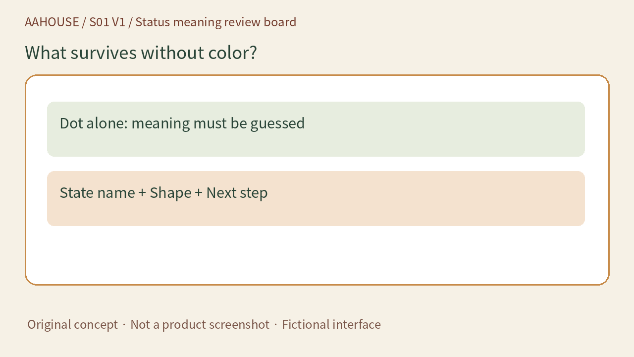
- Dot alone: meaning must be guessed
- State name + Shape + Next step
Unchanged original source explanatory diagram.
Name the state before decorating it
W3C explains that color should not be the only way to convey information.[1] We suggest replacing an amber dot with “Needs review,” then adding “Check the amount before sending.” Avoid instructions such as “Handle yellow items first.” Do not let green mean every kind of completion. A model finishing its draft, a person approving it, and a customer receiving it are three different facts.
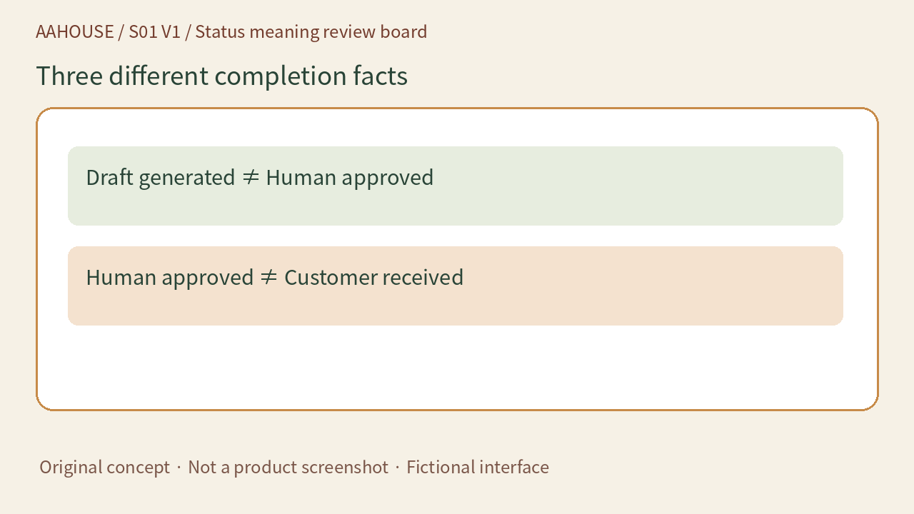
- Draft generated ≠ Human approved
- Human approved ≠ Customer received
Unchanged original source explanatory diagram.
Let icons help without becoming a puzzle
A pause symbol can accompany “Waiting for information,” while a warning triangle accompanies “Check required.” In our example, text explains the business state, shapes support scanning, and color provides an extra cue. Use the same names in lists, detail views, and exported reports. Avoid calling something complete on one screen while leaving only an unexplained green dot elsewhere.
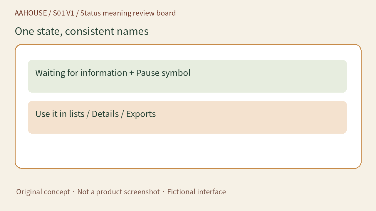
- Waiting for information + Pause symbol
- Use it in lists / Details / Exports
Unchanged original source explanatory diagram.
Contrast and redundant color cues answer different questions
W3C has a separate non-text contrast requirement for graphics needed to understand content and relevant visual information about controls, with exceptions.[2] Adding text does not resolve every contrast issue. Making red and green darker does not explain the business meaning. Ask separately: can people perceive it, and can they understand it? This article is not a complete accessibility audit or a legal determination.
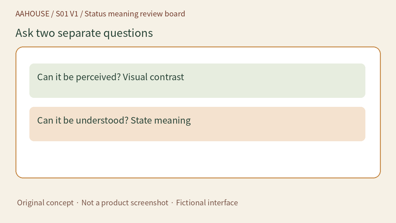
- Can it be perceived? Visual contrast
- Can it be understood? State meaning
Unchanged original source explanatory diagram.
Try a handoff rehearsal
We suggest giving a fictional queue to a colleague who did not design it. Ask them to find review items, explain the blocking reason, and identify the next step. Repeat with a grayscale version as an initial check and note remaining color dependencies. Grayscale does not simulate every visual impairment or replace full testing. Fix labels that could misdirect a handoff, so an ambiguous board does not undermine faster AI drafting.
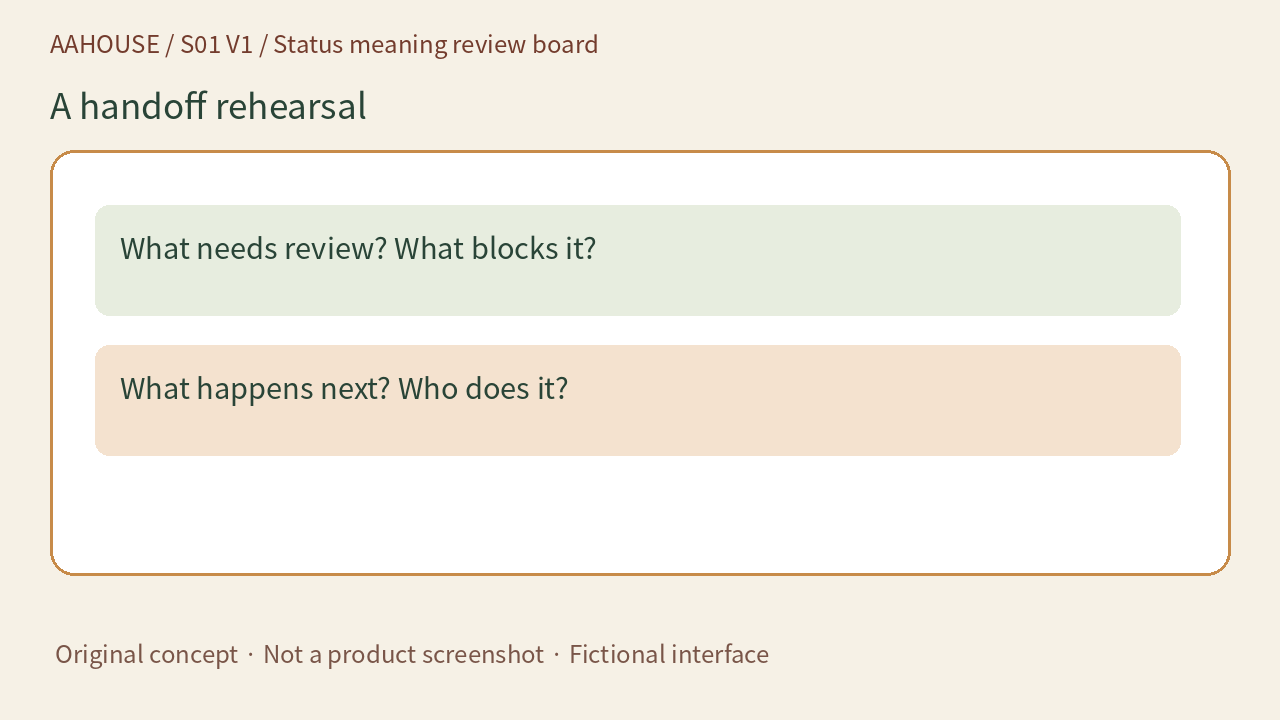
- What needs review? What blocks it?
- What happens next? Who does it?
Unchanged original source explanatory diagram.